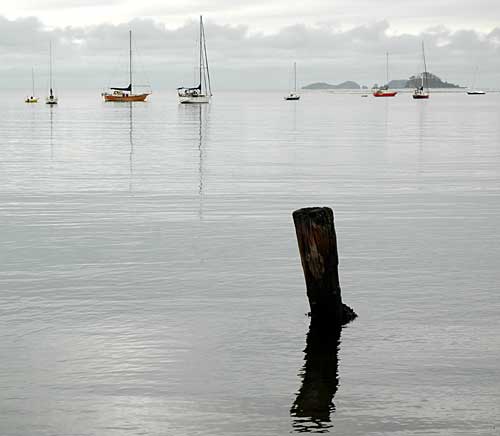
 Peter has been talking about foreground interest in images recently so I thought I'd post this picture I took last year at Bateman's Bay, New South Wales, along with a drop of critical self-analysis as to why I think this composition doesn't work.
- The foreground interest (FGI) - the post sticking out of the water - is too dominant, lacks texture and is positioned too far in from the right of frame. There’s a compositional rule (just waiting to be broken) which I believe says that you should divide an image into thirds, both vertically and horizontally. The post sits firmly on the line between two thirds, neither in one camp nor the other
- Although it is possible to get carried away with this thirds thing, I think the image fails on horizontal division as well. The horizon would be better a third of the way down the picture rather than at about a fifth to a quarter as it is. This would also have decreased the dead space in the centre and allowed more room for the sky; however I would have needed to get my knees wet to achieve this.
- I have had to crop the image horizontally to get rid of some land on the left and a boat on the right which offended me. This has resulted in an aspect ratio which is too squashed in for my taste for this particular type of image.
So there you are. Doubtless there are other niggles but there's only so much self-flagellation I can cope with. Perfection is a difficult mistress to satisfy.
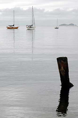
PS - Just out of interest I tried cropping it into portrait format. I've now got a group of three (which is nice) and the post is in a better position. Still not happy with the horizon though.
2 comments:
I definitely do like the portrait better than the landscape, and it's a shame you're not fond of the picture, it's a lovely post, so stark. What would happen if you lost the boats and horizon entirely and just let the post float?
Thanks Toby, I'll out the whip away.
Bluemama - I'll give a try - may add it later.
Post a Comment